Patty Toland currently working at Filament group. She talked about how to design consistency across responsive web. Here are the slides.
- When doing responsive site, client almost expect everything to be the same, just give us the break point
- Reality check: samsung, android etc, there are just overwhelming sizes and different type of devices(watch, e-reader)
- 67% of mobile users say that when they visit a mobile-friendly site, they’re more likely to buy a site’s service/product.
What is design consistency
- consistency is found in that work show whole and details are suitable for the occasion
- RWD needs to be ready for all different devices even when it’s not yet invented
- Triangle (speed, access, scale, style)
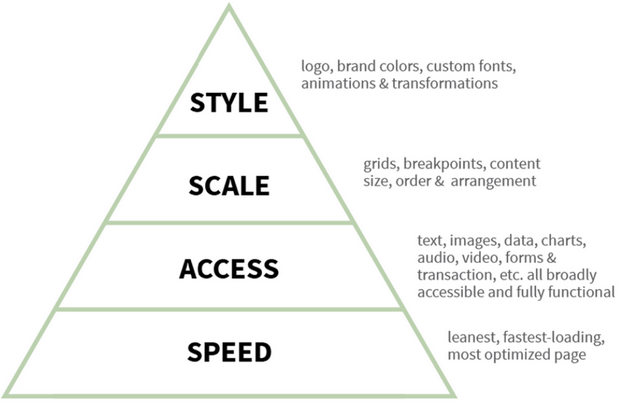
Speed
- they want page load within 2 seconds
- 250 milliseconds difference is detectable by users, and they’ll choose the faster one
- your analytics won’t tell you who left your site before it showed up
- filesize and page speed is design choice
- Challenges: custom fonts
- is it necessary? For everyone? Immediately?
- Speed should be part of the design process
Acces
- there is no reason to limit access to your content
- progressive enhancement is your friend
- involve QA teams when we’re talking about accessibility, bring them into conversation
Scale
- breakpoints (320, 768, 1024 is good starting point for static
- don’t necessary want to force them into development . Table responsive tool: Table Saw
- Do you really need those design element? like different fonts, rounded corner?
- Animations are very laggy on Android: try lay them over instead of moving things around
- Amulator won’t feel like the device feel
- Consistent is not identical