Laserfiche Mobile
Laserfiche Mobile is an ECM mobile app that allow customers to view, edit and search on centralized documents from Android phone and tablet, as well as iPhone and iPad. With offline feature, customers can get their document anytime anywhere. Laserfiche Mobile also makes collaboration easy by providing comment, business process, and tasks.
DATE
April-Sep 2014
SKILLS
Interviews, customer visits, wireframe, usability testing, tasks flow, prototype, ios design, android design
ROLE
Lead UX designer


Why?
Many Laserfiche customers have requested a way to access, search and edit document, and file expense report either on the go or in office. We see an opportunity to develop a mobile app on top of existing desktop and web application that would integrate into customer's daily workflow. For customers to work seamlessly across devices and be able to pick up where they were left off becomes our primary goal. We also decided to consider various screen sizes, phone and tablet, and different OS system, including both Android and iOS because these two are the dominate mobile OS for our customers.
Challenges & Consideration
When I got this project, the ios app has already been developed and I had the chance to work on the android app. The old app's flow was quite confusing so I decided to take this chance to redesign the structure and the interaction of our new android app. And later on update ios app to match android. There are a few challenges:
- Restructure the app: I want to redesign the app to make sure it meet users needs, and easy to use.
- Different platforms had different gestures and interaction: keep in mind that ios and android has different gestures but still keep the app consistent to reduce training times
User Stories & Flow
To ensure users have smooth experience on mobile and tablet, we talked to customers to understand their current workflow and how mobile fit into their daily tasks. After the key features are set, based on the user stories and scenarios, I created the flow for each feature.
- View document: being able to quickly pull up a document securely while meeting with clients.
- Content creation: while traveling, being able to upload receipt is always a time-saver. It's efficient if people can fill out expense report on the go.
- Offline: government officer often have to go to field to collect information, but they don't have data on their tablet. Offline feature becomes a key for them to store information in the moment.

Business Process Tasks
Right after we released the first android app, we got an announcement from our president that we need to incorporate business process tasks into our app so that users can fill out any form, or complete any tasks while they're on the go .
It was an interesting challenge because our app is mainly for storage and viewing, incorporate tasks into our app would add complexity to our app. You'll see in the comp how I make this app easy to navigate while allowing people do tasks and browse files.
Design Studio
Because the business process tasks involved another product team, I invited other designers, writers and product owners to do a design studio. With a clear problem statement to solve, we came up with some good ideas how to consolidate tasks and file storage. It's always good to bounce idea from each other.
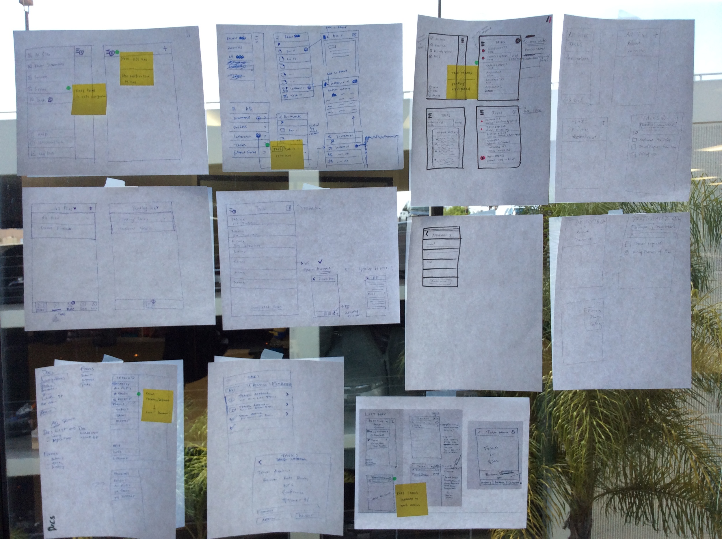
Ideation & Sketches
After figuring out the flow, it's time to draw it out on the paper. I like to sketch out ideas before putting them into the software.
Wireframe
This is an example of a wireframe i put together for offline flow.
Prototype
I made a hi-fi prototype using the prototype app InVision to better illustrate the flow and get feedback from stakeholders and development team .
Style Guide
I also created a style guide for consistent look and for developers to reference.
User Testing
After implementation and iteration of UI changes, I plan a series of user testing within organization and later on our customers during Laserfiche conference. We had a UX booth setup for user testing. We want to make sure we can be as agile as possible, so when internal user testing was done, we fixed most of the issues we found. It makes the later testing with customer more valuable. Some of the major findings:
- Animation and transition needs to be improve to enhance the experience. Some of the pages are lacking transition, resulting in customer confusion whether the task was succeeded or not. I later on brought back this issue to the team and we're researching a better way to transition from one screen to another.
- Both ios and android users tried to long press on select entry. We initially designed different gesture on ios and android, but we noticed that some of the interaction is actually similar. We decided to make long press to select on both devices.
- When asked to review the history of completed tasks, most users look at the left navigation and spend a long time figuring out they can filter their completed/pending tasks in the tasks page. We decided to match our desktop app by moving history into the left navigation.
- Our users have no problem finding and using hamburger menu! In our scenario, the hamburger menu is used as a central hub to get to else where.


Outcome
I took the result back to the team, and created a google spreadsheet to track the issues that we need to research more or fix. The release is extremely successful, our first android app received 4.5 star in google play app store. During user testing, customer expressed it's so much easier to use than the old app.
The Laserfiche Mobile app are on both Android and IOS. The design works never end, we iterate and iterate. The team is always seeking feedback, talking to customers, and improve the experience.
Design


Create Document
Users can take photo or choose photo from their album, and upload it securely into Laserfiche.


View Document
When open a document or a task, they'll see a similar layout with title and content. Since the main usage is for viewing, all the actions are packed in the overflow icon. We found that people understand the overflow icon and don't have problem finding actions.


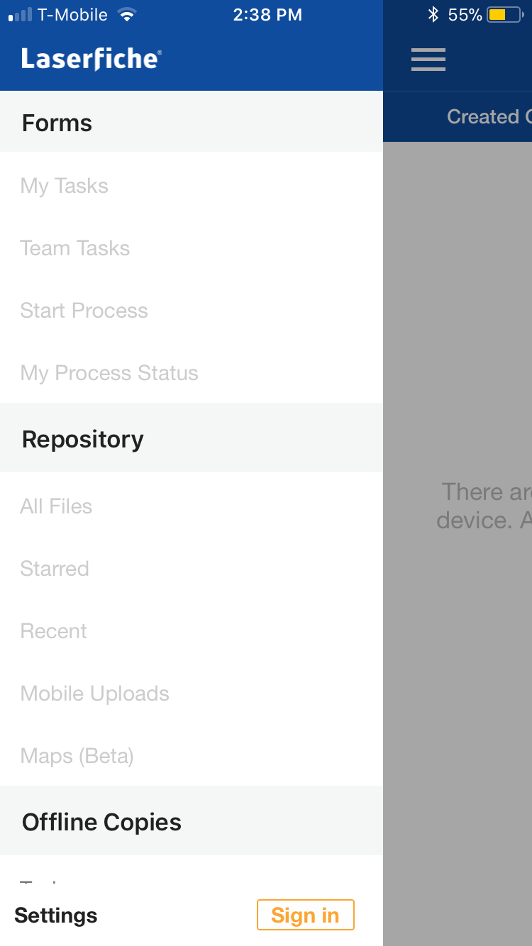
Left Navigation
The left navigation contains tasks and files.
You can see the header is styled differently because we considered the use cases for both tasks and files, and they are pretty different from each other. We decided to keep them separate in the left navigation so users know clearly where they are in the navigation. And our users find it very easy to navigate between tasks and files.
The hamburger icon on the top right will display tasks when there are tasks pending. They are useful reminder when users are working on something else.
You can also find offline copies under files when customers don't have internet connection. Customers are happy that they can access offline document when they are out in the field or on airplane.
Tasks
Our users finding it useful to complete tasks on the go. It's grouped by date assigned, but users can sort the tasks by priority, business process and started by.