Laserfiche Help
Laserfiche Help is a responsive website that help customers solve their problems by searching and browsing categories. With smart filtering and topics that are broken down based on the experience level with Laserfiche softwares, customers can find what they are looking for easily and explore similar topics.
DATE
Feb-Jun 2014
SKILLS
Interviews, ideation, information architecture, affinity diagram, storyboarding, interaction flow map, personas, wireframe
ROLE
Lead UX designer

Why?
Companies have always spent so much attention on their homepage and I understand why, it makes good first impression and draws potential customers. However, it takes more than that to maintain good relationships with existing customers.
Laserfiche Help have always play an important role helping users with latest fixes, releases, and educational resources. But the current site was built in 2008 and have never been updated since. We decided to take initiative and redesign the site.
Goal
Redesign and restructure the information architecture of Laserfiche Help so that the information is accessible and findable. With the new site, we hope to reduce support call and increase the sense of community.
Research Process
To innovate the process at Laserfiche, we approached this project with user research up front.
- 14 individual interviews
- Affinity diagram analysis
- Personas & Scenarios
- Tasks flow
- Storyboarding
- Interaction flow map
- Competitive Analysis
Interviews & Affinity Diagram
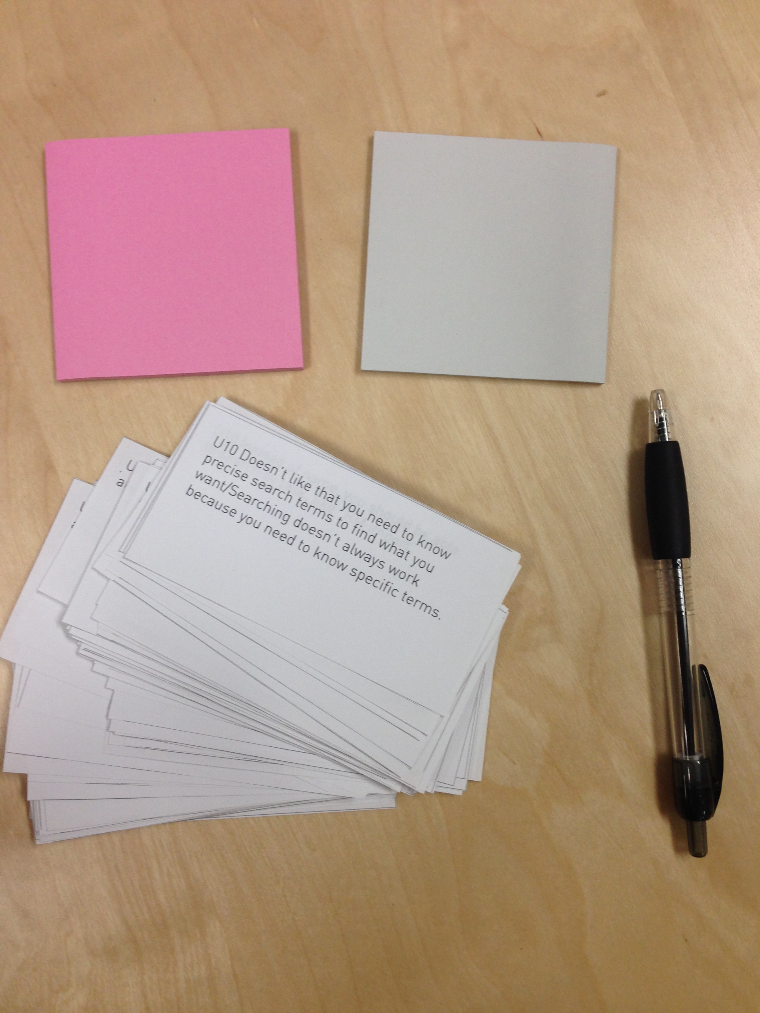
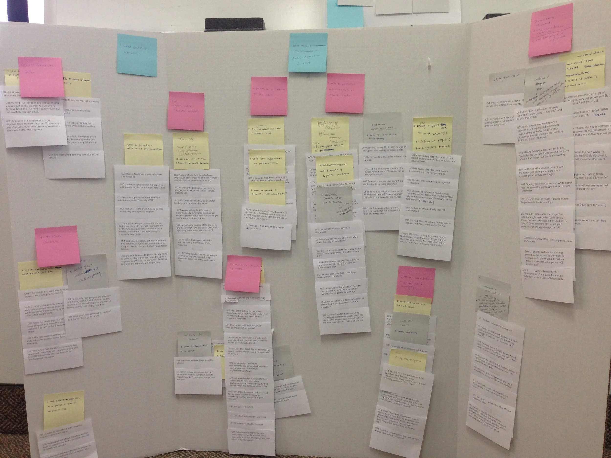

We interviewed 14 individuals including customers, support team, solution engineers, and CTO. Our questions includes: what does Laserfiche Help means to you? Walk us through the last time you used Laserfiche Help. What is the hardest part about solving problem using Laserfiche help. Rather than asking what they like and what they want the software to be, we focus on how their current behavior and the pain points of using Laserfiche Help. After the interview, we used affinity diagram to analyze the data bottom-up. There are total of 140 notes. Finding:
- People don't know the difference between different content type, they just want to get to the content as quickly as possible.
- Search and browse are equally important.
- People come here when they have a problem to solve.
Personas & Scenarios
Based on our interview findings, we went ahead and use Lean UX's approach to create quick persona. We have three different type of users. A reseller, a IT admin and end user. When creating the personas and scenarios, we focus on three aspects:
- Demographics
- Pain points
- Potential solutions
Storyboarding
To illustrate the scenario better, I created the storyboard for the end user scenario.
Interaction flow map after re-structure
Information Architecture
We also took a look at the current information architecture and proposed a new architecture based on the research finding.
Comparative Analysis
Comparative Analysis on 15 major help/support site was conducted to learn how others organize their information, and in which aspect they succeed or fail. We didn't include our own product because it's so out-dated in every aspect, instead we looked at other products to identify what could work well with a large number of products.

Define Design Goal
After all the research, we translate the research data into design goal. It helps us focus on the key feature that we want to achieve.
- Browse is as important as search
- Product centric navigation
- Content types really don't matter to customers, they just want to find answers
We also got feedback from stakeholders and president:
- We want people use Answers more to create a sense of community
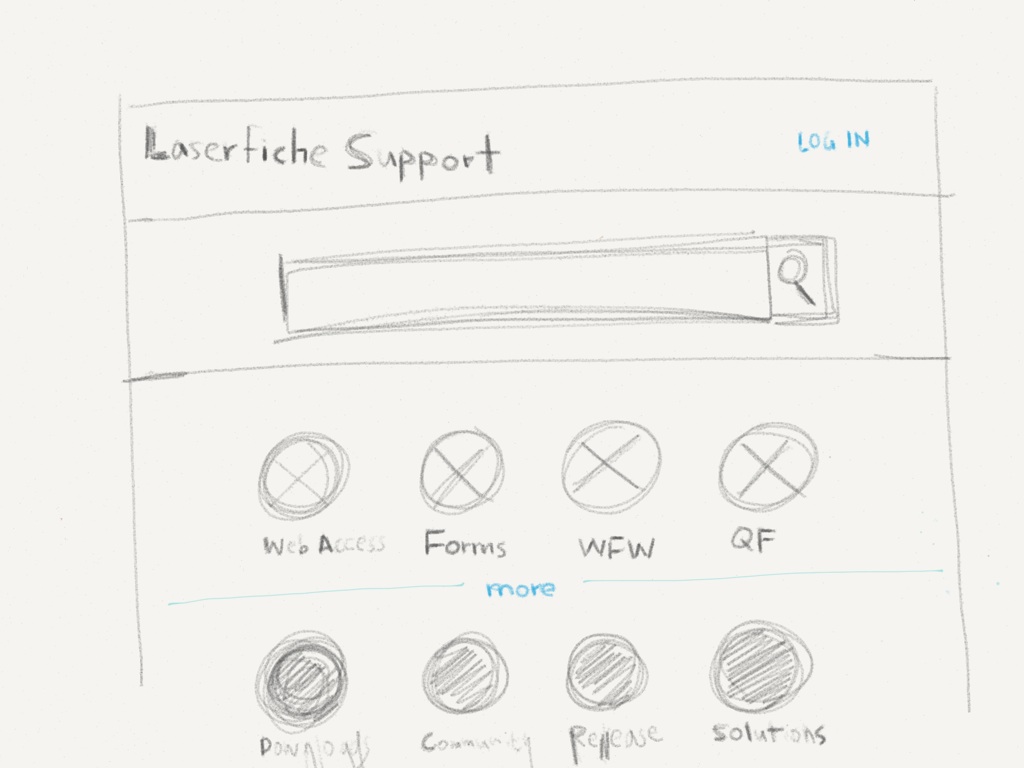
Ideation
I explore different directions by sketching as many ideas as possible fairly quickly. The app Paper made it easier to sketch on my iPad.


wireframe & Implementation
After sketching and discussing with the team, I translate the result into wireframe. While in the wireframe stage, we also took responsive design into consideration, and took the "Mobile First" approach. The wireframe received great responses and people are excited to see a new look. It is in the progress of implementing.
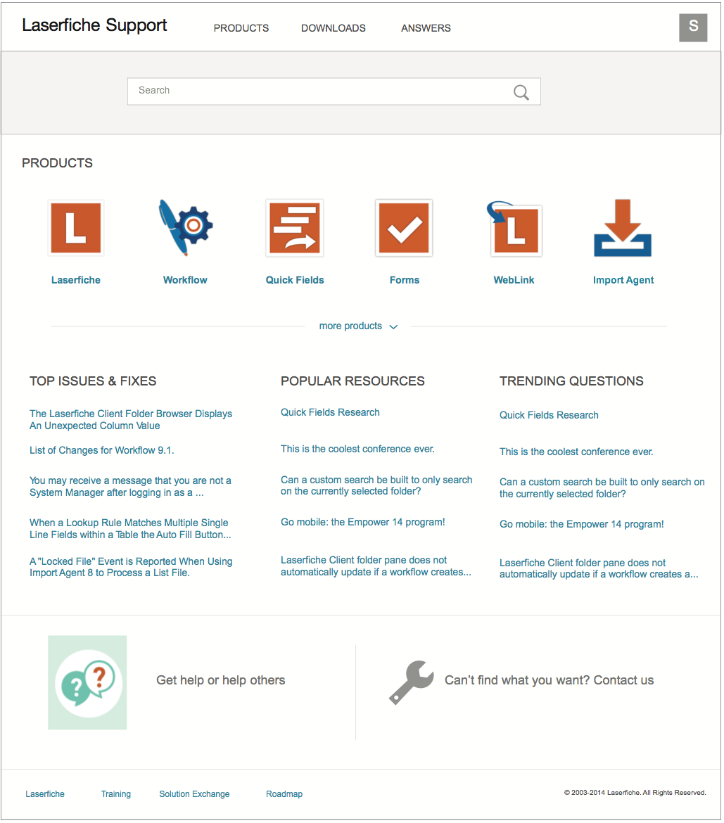
Home page
This is the help site landing page where users can browse to a specific product or search. They can also use the top navigation to quickly access download or go to community for answers.
More products are hidden under the more link to avoid over-crowding the UI.
The most popular resources are listed in the homepage for easy access.
Community and online chat is highlighted with graphics. You might notice already answers and community is showing more than once, that's because I want to make sure it's integrated well in the help site but at the same time it's prominent enough to draw users attention, so we can meet the business goal.
Footer is for additional resources.

Product page
This is a specific product page where user can find all the resources related to this product.
The top of the page is where users can filter based on version and platform(e.g desktop, web, mobile)
Announcement section on the top is where admin can pin important information, such as a hot fix, or a popular material.
Below we categorize information based on their experience level. The information closer to the top is more beginner level, and the closer to the bottom is more advanced.
If they can't find information, they can ask the community.

Article page
Clicking on any link will bring users to the article page where uses can read, watch video, and discover related articles.
They can also browse between different topics within the same group using the top left nav.