Laserfiche
Laserfiche Cloud is a content management application for enterprise level organization. With Laserfiche Cloud, user can search, retrieve and collaborate on documents from anywhere they want.
DATE
Jun 2014- Feb 2015
SKILLS
Interviews, customer visits, affinity diagram, wireframe, design studio, usability testing, prototype,
ROLE
Lead UX designer
Why?
We have this 12 year-old product that is very cumbersome and complex to accommodate different persona and use cases. However, lots of functionalities are out of date and very hard to use. We decided to redesign the UI as well as the experience, to streamline, simplify, and refocus on making users' day to day task efficient.
Interview & Affinity Diagram
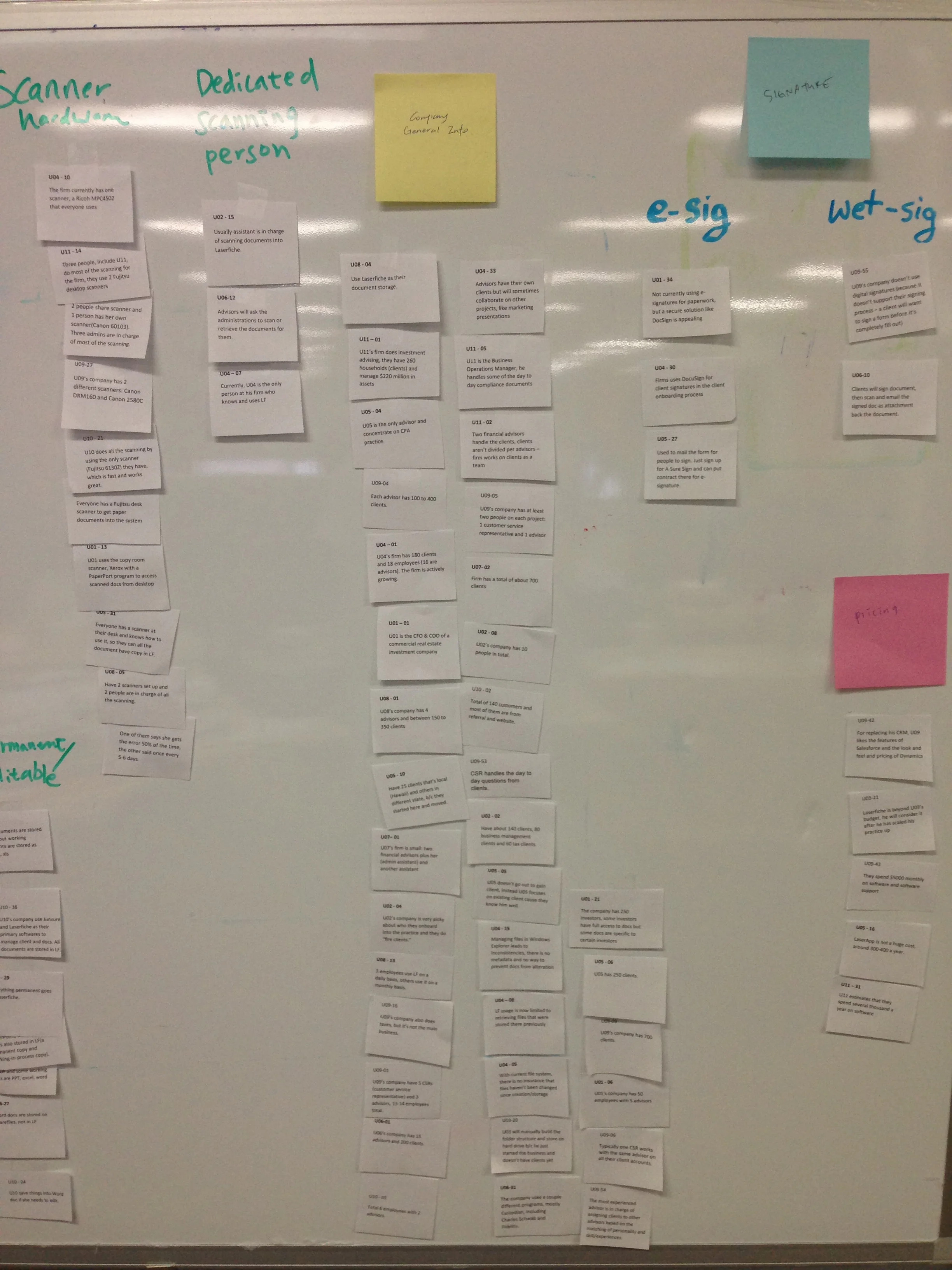
To start, we interview different market segments to understand their current workflow, pain points and how they are using Laserfiche, starting with financial advisors. After gathering a large amount of information, we use the method Affinity Diagram to group information into different categories. By grouping similar notes together, we started to see trend, patterns, and problems.
Demographics:
- 13 total interview
- Company size: 1-18 people
What we found
- Financial advisor need to find document quickly when they're with clients
- They wish to access document anytime they need using different platforms
- Quickly complete action such as export, email
- Metadata are not being used often because it could be time consuming
Persona
After interview and analysis, I created a persona to illustrate our target demographic and their goal.

Design Studio
Based on the findings from interview, we brainstormed possible solutions and prioritized the feature based on different teams schedule. To get the expertise from everyone in the team, I decided to do a design studio. It's the best way to gather product owner, developers, QA, designers and writer to work on the same problem.
We got interesting ideas and we can find some ideas merging.
I think design studio is a really good way to get ideas out of different roles, and getting team member on board with new design.
Competitor Analysis
We looked at various competitor products and highlight what advantages we have and what we lack. We found out that most enterprise document management software provide only folder structure, but very few allow customers to create metadata along with document. We saw the opportunity to help users create metadata and use it efficiently.
Responsive Research
I took "Mobile first" approach and created wireframe for phone, tablet and desktop. Before I began, I did some research on other document management products.
Key Consideration
After gathering all the information, these are some key considerations that I keep in mind when designing:
- Being able to quickly find a document
- Responsive design is important because our customers use tablet and phone to view document
- Easy way to get information about a document
- Complete actions within short amount of time
Sketch & Ideation
After all the data gathered, I like to sketch out my ideas using pencil and paper. It's the best way to quickly draw out different possible solutions and see if it works.
Wireframe & Responsive
I brought everyone's idea back, and try to integrated them into the design. I like to focus on mobile experience first, and expand the design to tablet, than desktop, because it makes me focus on the most key features. I also make sure the experience is consistent across different screen sizes.
Prototype
I have created a prototype for tablet responsive to give the team a better idea how it would work. Through iterations, team member's feedback is incorporated into the final design.
Mockups & Specs
After the visual designer put together the UI elements, I created mockups and specs so developers can start the implementation.

UX Standard & Consistency
During development, I work with other designers to define standards and behaviors for different UI element. Reviewing the latest build to ensure the behaviors meet the standard is one of my daily task. It's a major goal of mine to ensure the product suite is consistent not only in Laserfiche Cloud, but in other products as well.
Mentoring
Currently I'm mentoring a new UX designer on the design process. With another pair of eyes, we want to make sure the products look and behave consistently.
Usability Testing
We tested out our new design internally first and fixed most of the findings first so we can get the best out of user testing with real customers. We set up a booth at our annual Laserfiche conference to test the implemented product. We conducted usability test with 10 Laserfiche users, both old and new.
We found out that all users attempted to right click for actions. They were used to right click coming from using desktop application. Right click wasn't our first priority because we weren't sure if people will use it, but now we can optimize the right click menu for common actions!
Another finding is that users expect everything will automatically refresh. When saving a document name in a different browser tab, they expect the document in folder listing get updated as well. Because it didn't automatically refresh, users were confused and thought they failed the tasks.
Other than that, users love drag and drop to upload a file. They also like how easy it is to create tag and view the metadata at a glance.
Result
The product is currently in beta. We have invited several beta users and resellers and gathered feedback from them. The feedback has been very positive, our reseller express they can't wait for the official release to come out. They already have several customers waiting in line to start use it. Currently I'm planning on the next user testing to get users feedback.
Some quote from our customers:
“Layout is more intuitive”
“The new Cloud platform makes better use of the space”
“Definitely more sophisticated”
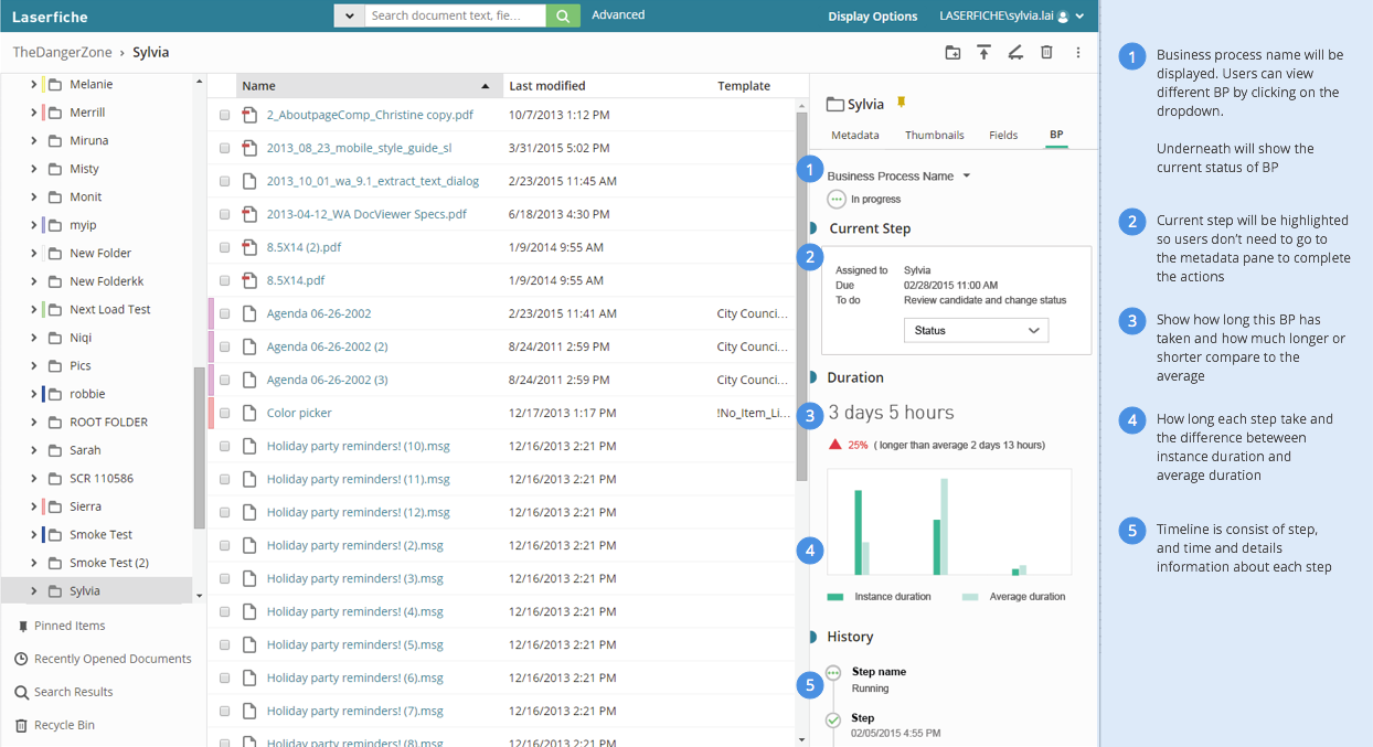
Folder Browser
The left pane provide different ways to access a document
- folder tree to access different folders and subfolders
- recently opened document
- document in use
- recycle bin
Action bar is contextual, based on different tabs and different entries selected, the actions will change.
The details pane is the biggest change that people love. This metadata pane is an aggregated view of all the information users need. More advanced information like volume or security rights is hidden under advanced. But the rest of the information is displayed. When no tag, template or link is created, it'll show a link so users can click on it to create these metadata. When they don't use it, it's out of their way. When I put this together, I explained the use cases, how it's rarely used, and how this is better than 6 or 7 tabs that users has to click to find out if there is information. People love it!
Document Viewer
When clicking on the document name, document viewer will open in a different browser tab. Customers can view between pages, click through thumbnail, and annotate.
On the right is the same details pane with annotation pane.
Users can customize the view by clicking on "Display Options". We later made it more discoverable by adding a border around it so it looks clickable. If you notice, there is a toggle for continuous scrolling. That's one of the finding from user testing, I notice the frustration from users when they try to scroll but fail. We added continuous scrolling instead of single page and have to page through. Our users love it.
Search
Search is another big change. We notice that the current search behavior is really complex and we want to make that more easier to use. Most common use is quick search on the top, so we make it a lot prominent at the top. Once click on advance search, the dialog pops up with the most common advanced search type display by default. Users can configure their search by adding different search types.
During user study, user expressed the ease of use of advanced search compare to the old design. And they appreciate the default set to get them started.
Responsive
We spent time looking at different screen sizes and different devices to make sure the experience is familiar and smooth.